SeoVillage Resort & Spa is a premium website concept created for a modern countryside resort that combines luxury accommodation, fine dining, and a relaxing wellness experience. The goal was to craft a digital atmosphere that reflects silence, nature, and understated elegance while making every interaction effortless.
The visual direction is built around spacious layouts, refined typography, cinematic photography, and a restrained color palette. Every section is designed to immerse visitors in the feeling of a peaceful escape, encouraging them to explore the resort and book their stay with confidence.
This project focuses on balancing emotional storytelling with a seamless user experience, resulting in a timeless and sophisticated hospitality website.
CONTEXT
SeoVillage Resort & Spa needed a website that would communicate more than just accommodation—it had to capture the atmosphere of a quiet retreat surrounded by nature. The challenge was to create a premium digital experience that reflects comfort, exclusivity, and relaxation while keeping navigation simple and intuitive.
The design emphasizes elegant typography, immersive photography, generous white space, and carefully balanced layouts. Every visual decision was made to reinforce the resort's identity, helping visitors feel the calm and luxury of the destination before they even arrive.

LOGO DESCRIPTION
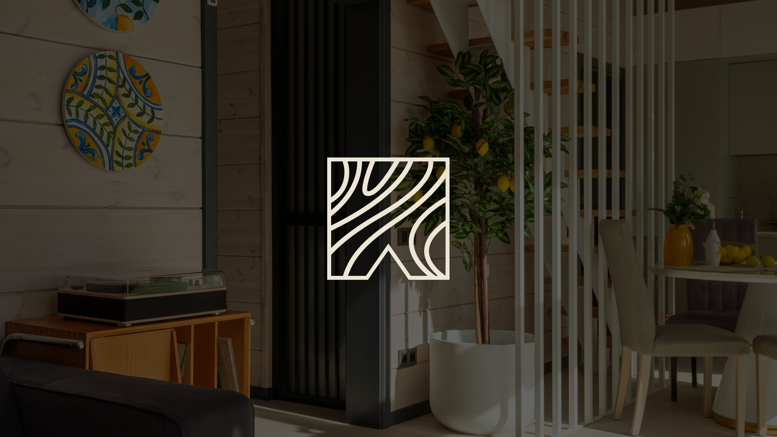
The SeoVillage logo is inspired by the natural landscape surrounding the resort. Its abstract geometric mark combines flowing organic lines with a clean architectural silhouette, symbolizing the harmony between modern luxury and untouched nature.
The minimalist typography reinforces the brand's premium character, while the warm ivory-on-black palette creates a timeless and sophisticated identity. Together, the symbol and wordmark communicate elegance, tranquility, and an exclusive retreat designed for guests seeking comfort, privacy, and relaxation.
TYPOGRAPHY & COLORS
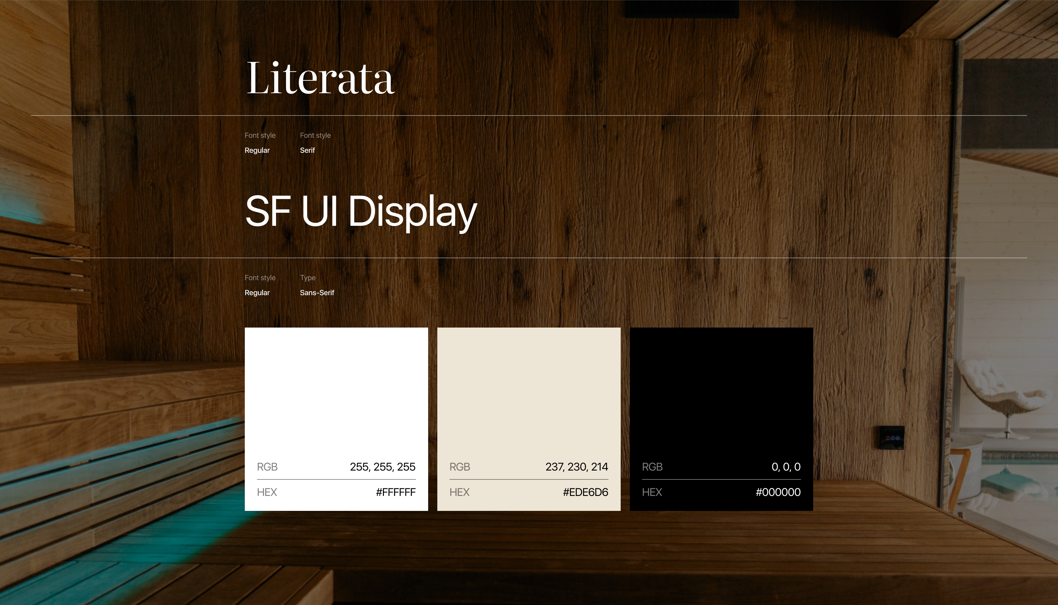
The visual identity is built around the contrast of elegant serif typography and clean modern sans-serif text. Literata is used for headlines, adding sophistication and a timeless editorial feel, while SF UI Display ensures excellent readability across navigation, interface elements, and body copy.
The color palette embraces understated luxury through a restrained combination of warm ivory, pure white, and deep black. This minimal selection creates a refined visual hierarchy, allowing photography and spacious layouts to become the focal point while reinforcing the calm, premium atmosphere of the resort.
