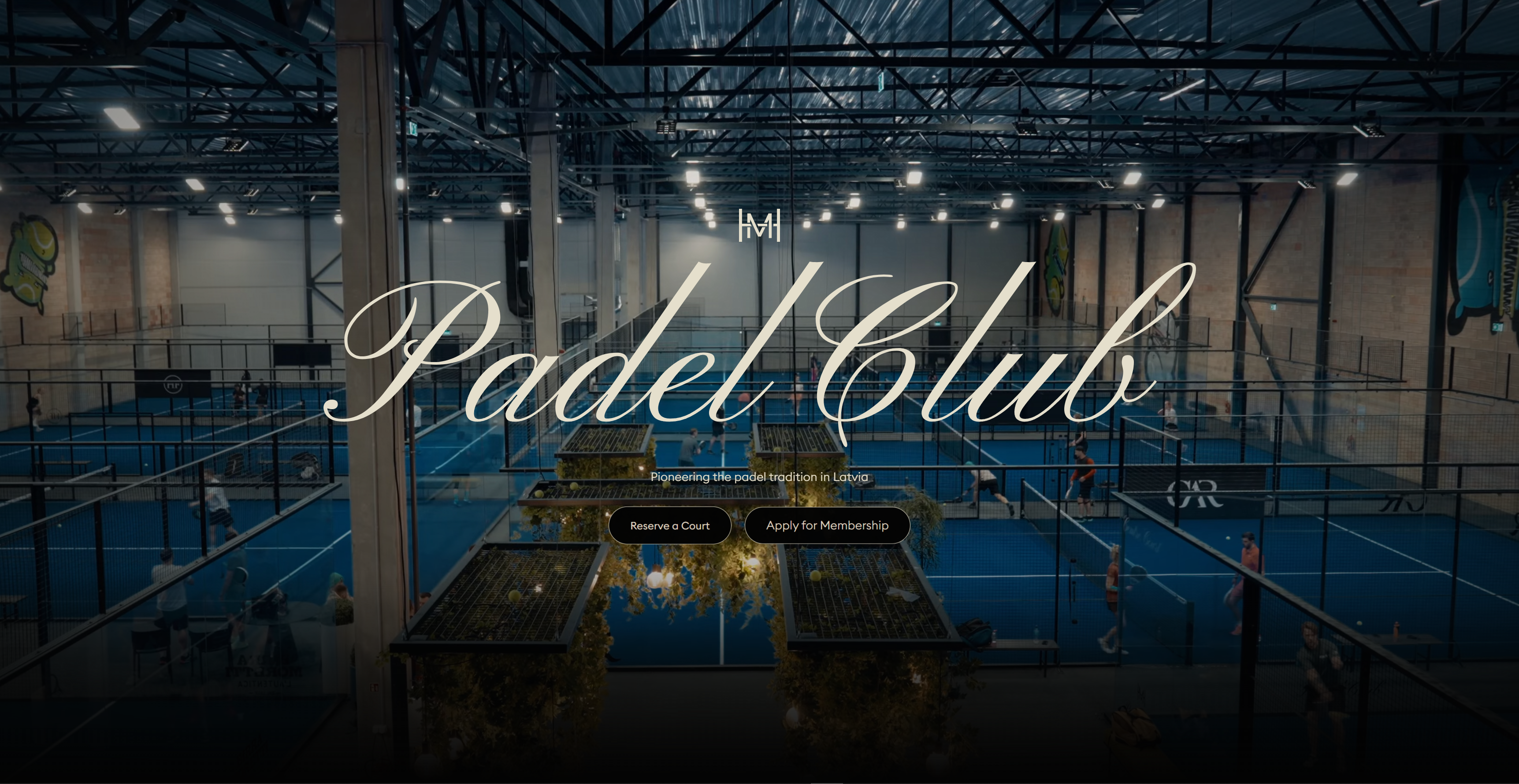
MH Padel is a premium padel club and lifestyle brand based in Latvia, focused on combining sport, wellness, and community within a refined club environment. It positions itself not simply as a sports venue, but as a curated private-style destination where padel is presented through high standards of design, hospitality, and social culture. The brand emphasizes exclusivity, elegance, and disciplined club values, offering world-class courts, coaching, wellness amenities, and membership-based experiences.
CONTEXT
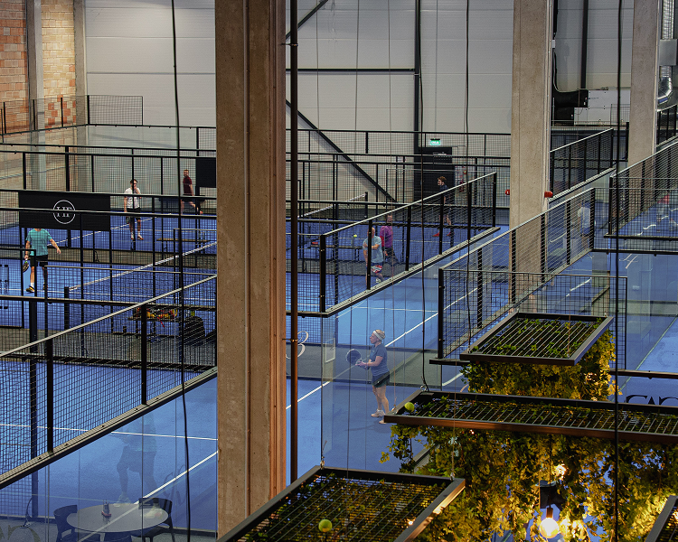
Padel is one of the fastest-growing sports globally, evolving from a niche activity into a contemporary social and lifestyle phenomenon. Its appeal lies in accessibility, energy, and the unique balance between competition and connection. As urban audiences increasingly seek experiences that combine sport, wellbeing, and community, premium padel clubs emerge as new cultural destinations rather than traditional sports facilities.
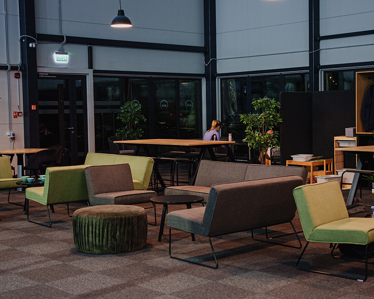
Within this landscape, MH Padel positions itself as a refined environment where athletic performance meets elevated hospitality. The brand reflects a modern interpretation of club culture — disciplined, social, and aesthetically curated for a new generation of active audiences.
LOGO DESCRIPTION
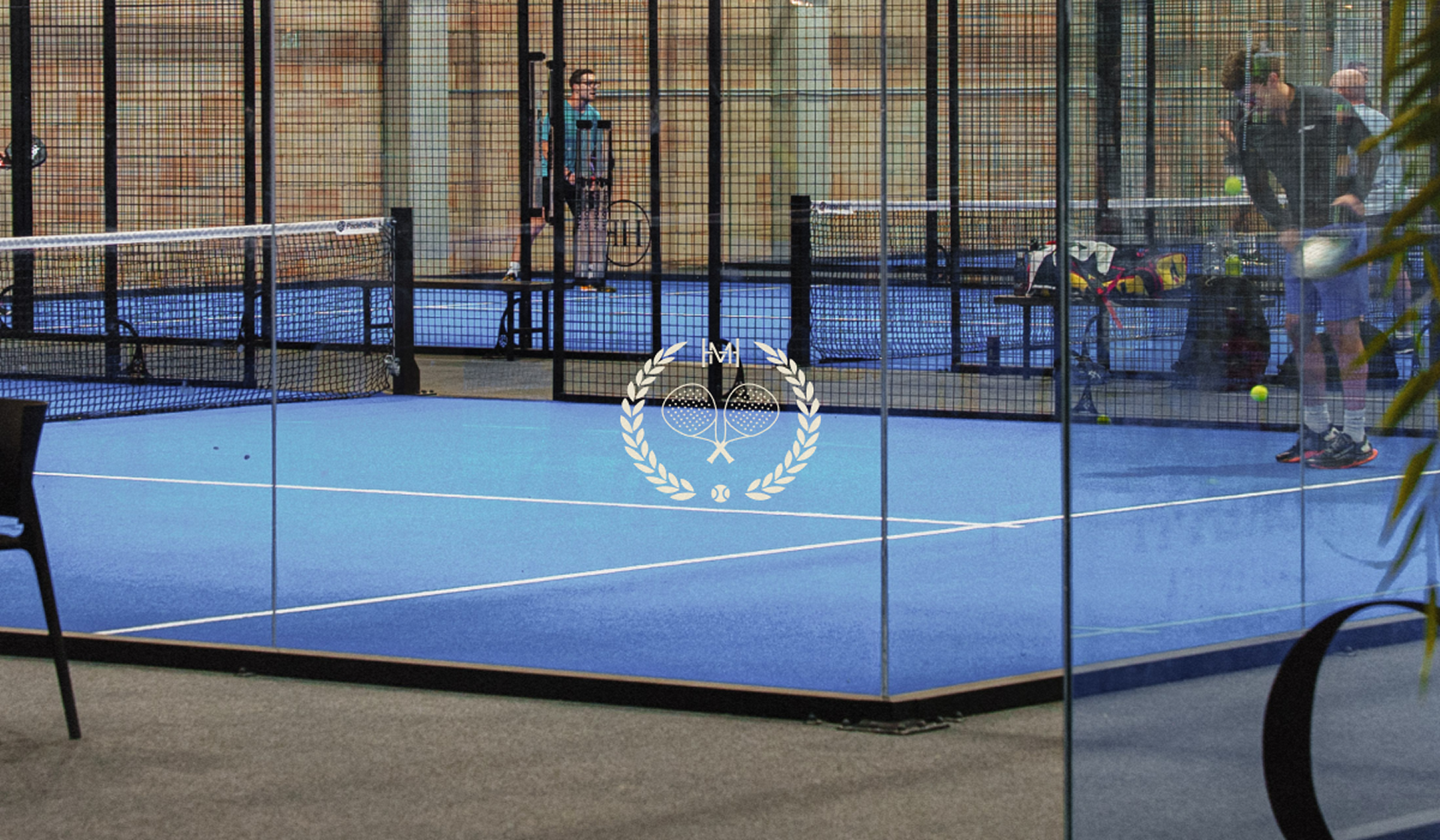
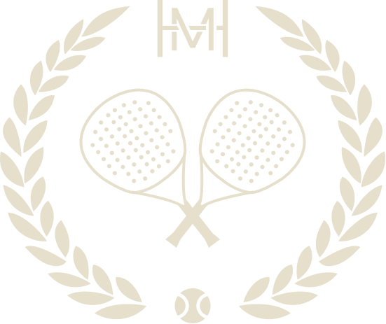
The logo combines classical symbolism with contemporary minimalism, expressing the brand’s premium club identity through a balanced and recognizable emblem. At the center, crossed padel rackets form the core visual element, directly representing the sport and emphasizing precision, discipline, and competitive spirit.
The surrounding laurel wreath introduces references to achievement, heritage, and prestige, reinforcing the atmosphere of an elevated club culture. The monogram placed above functions as a distinctive brand signature, adding exclusivity and strengthening memorability.
The composition is completed by the ball positioned at the base, creating visual balance and grounding the emblem in the world of sport. The restrained monochrome palette enhances elegance, clarity, and timeless character.
TYPOGRAPHY & COLORS
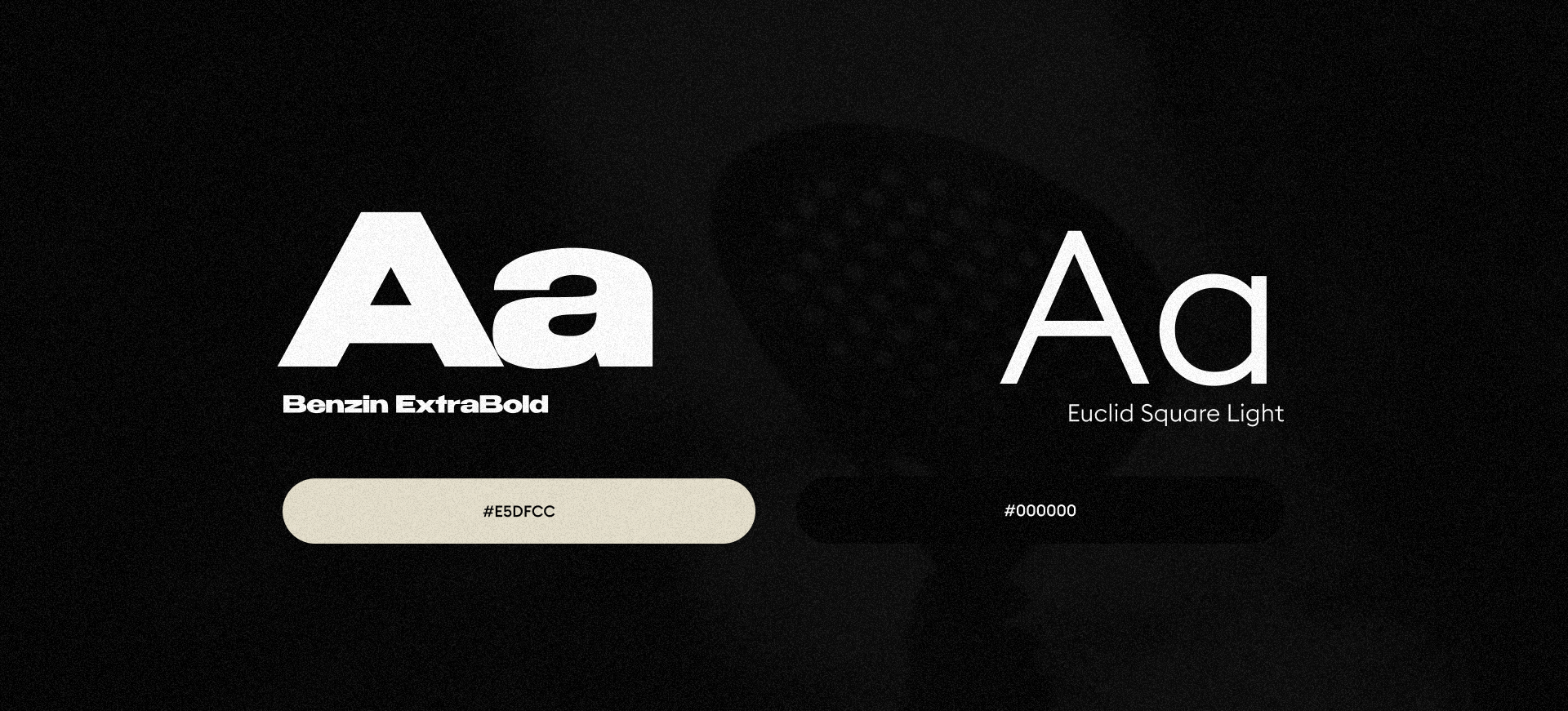
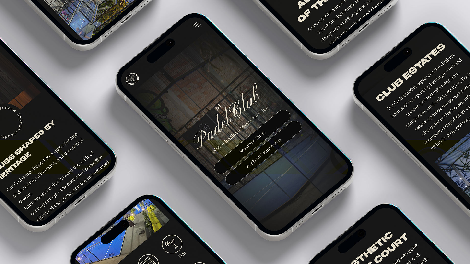
The visual language is built on the contrast between expressive typography and restrained color minimalism. Benzin ExtraBold serves as the primary display typeface, introducing strength, impact, and immediate recognizability. Its geometric weight gives the identity a confident and contemporary character, reinforcing the bold presence of the brand across headlines and key visual statements.
Euclid Square Light complements the system as a secondary typeface, bringing clarity, balance, and sophistication. Its clean construction creates visual rhythm and supports readability in informational and supporting content. Together, the two typefaces establish a dialogue between power and refinement — reflecting both athletic energy and premium club aesthetics.
The color palette is intentionally minimal: deep black (#000000) conveys discipline, focus, and exclusivity, while soft ivory (#E5DFCC) introduces warmth and understated elegance. This restrained contrast enhances timelessness and allows the brand to maintain a strong premium presence across physical and digital applications.
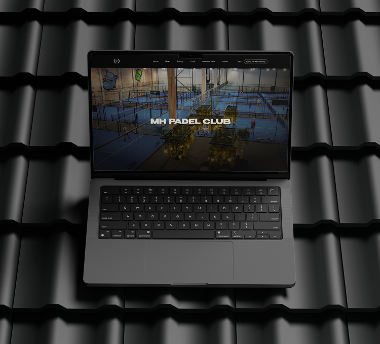
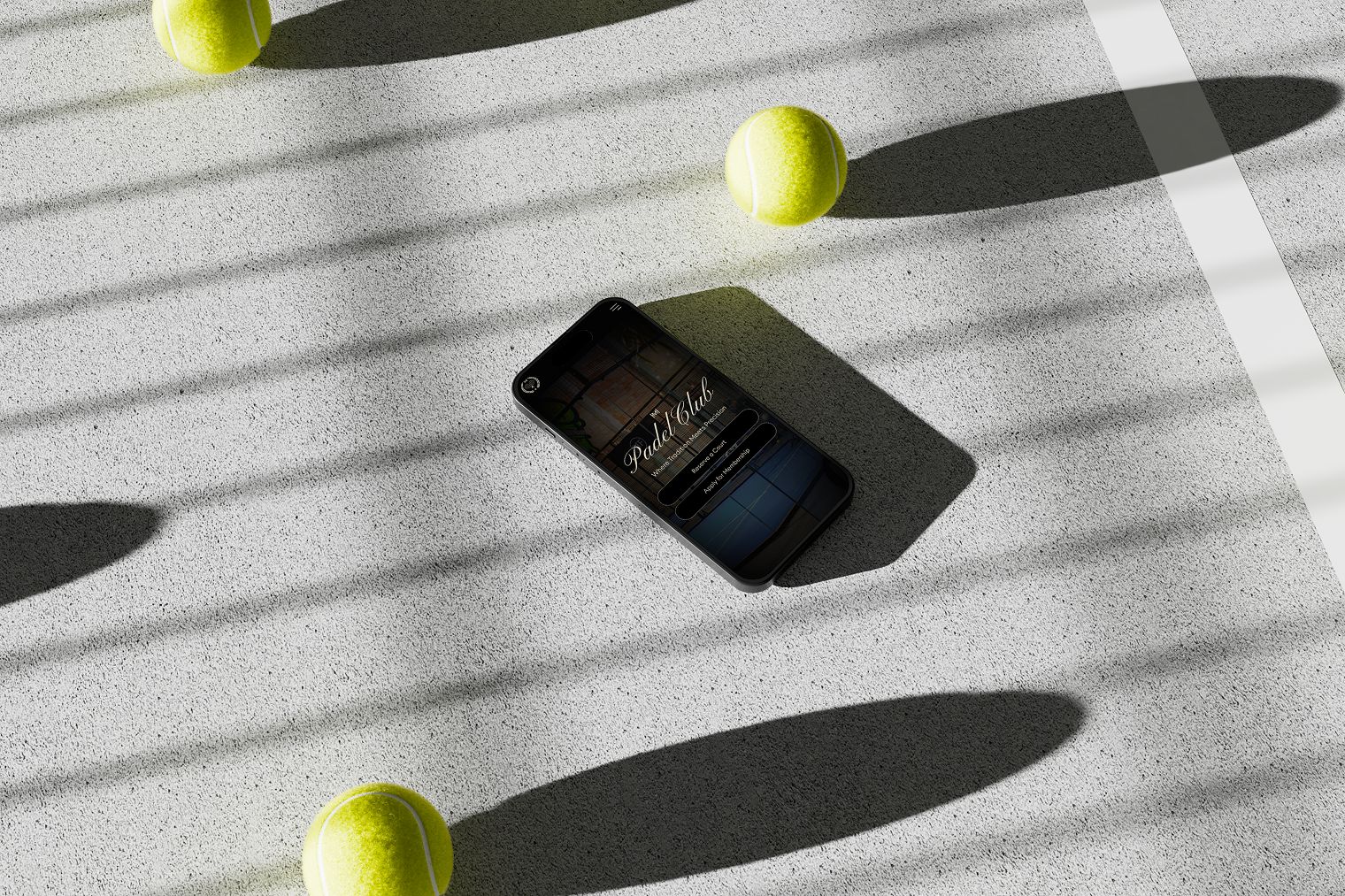
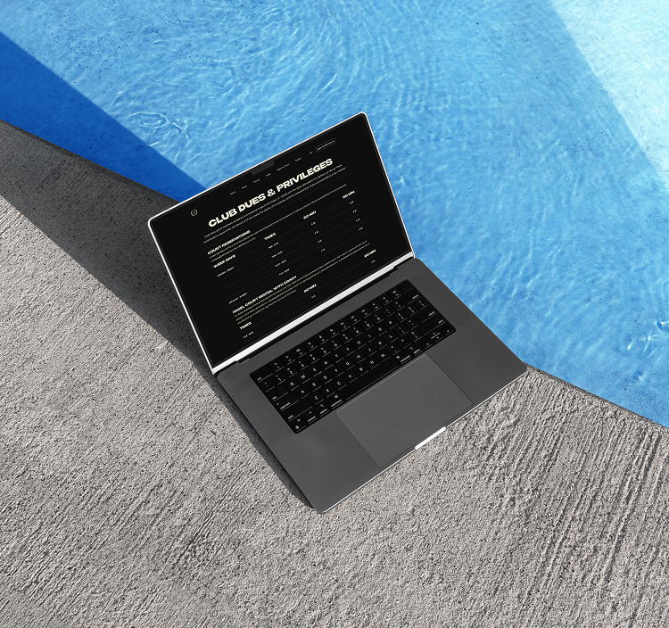
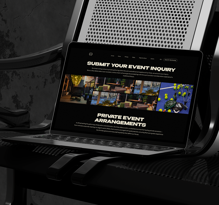
Final Summary
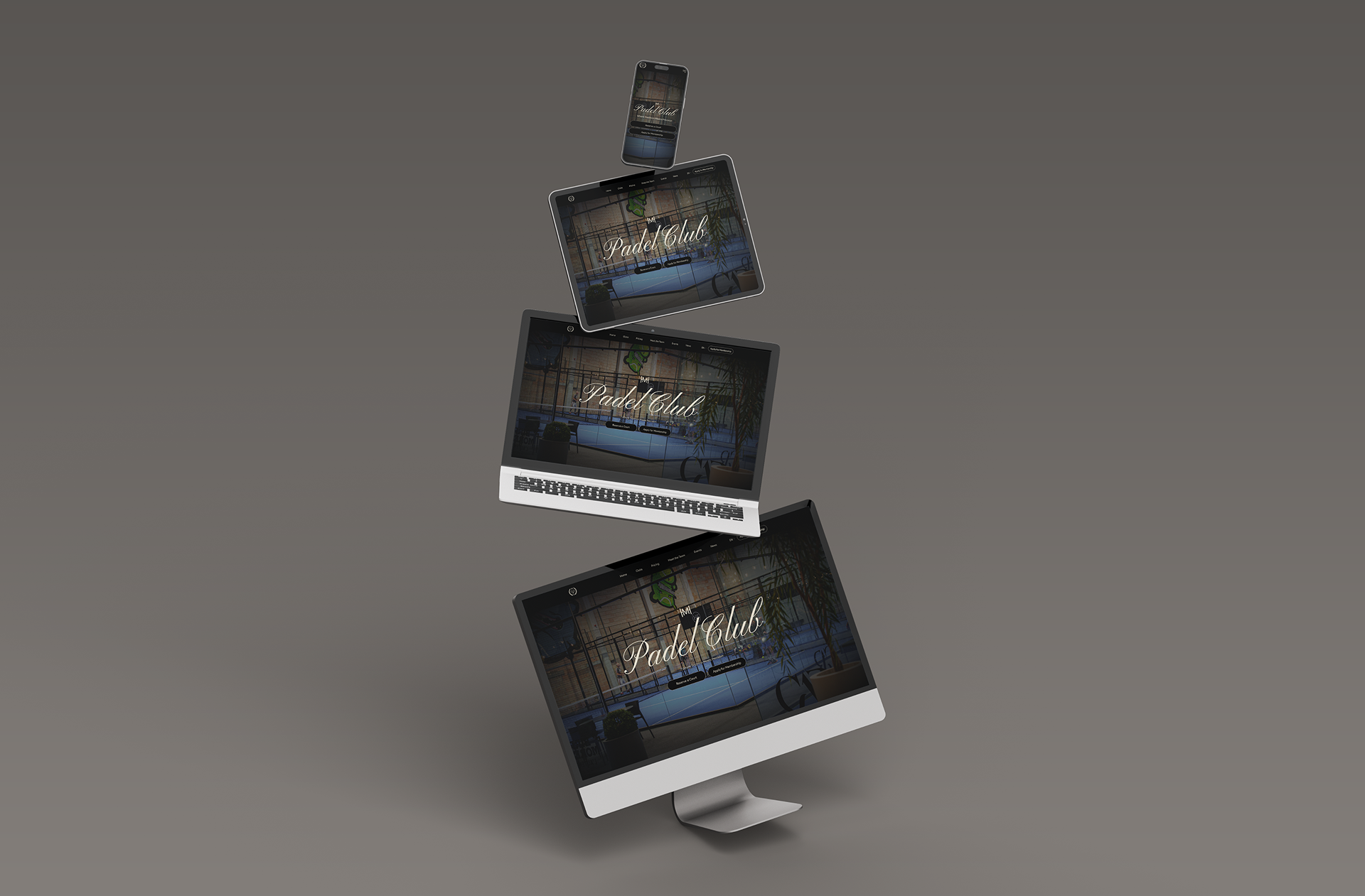
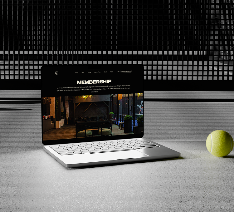
Together, these visual elements form a coherent identity system that defines MH Padel as more than a sports brand. The combination of symbolic heritage, bold typography, and restrained color choices creates a visual language rooted in discipline, elegance, and contemporary club culture. Each component is designed to support a perception of quality, precision, and exclusivity while remaining clear and highly recognizable across different touchpoints.
The identity reflects the broader idea behind MH Padel — a space where sport is experienced not only through performance, but also through atmosphere, social interaction, and aesthetic standards. The balance between strong graphic presence and minimal visual restraint allows the brand to communicate confidence without excess, creating a timeless character that can grow consistently across physical environments, digital platforms, and future brand extensions.
As a result, the visual system positions MH Padel within a premium category where athletic energy, cultural relevance, and lifestyle value exist within one unified brand experience.