GUMEE VITAMINS
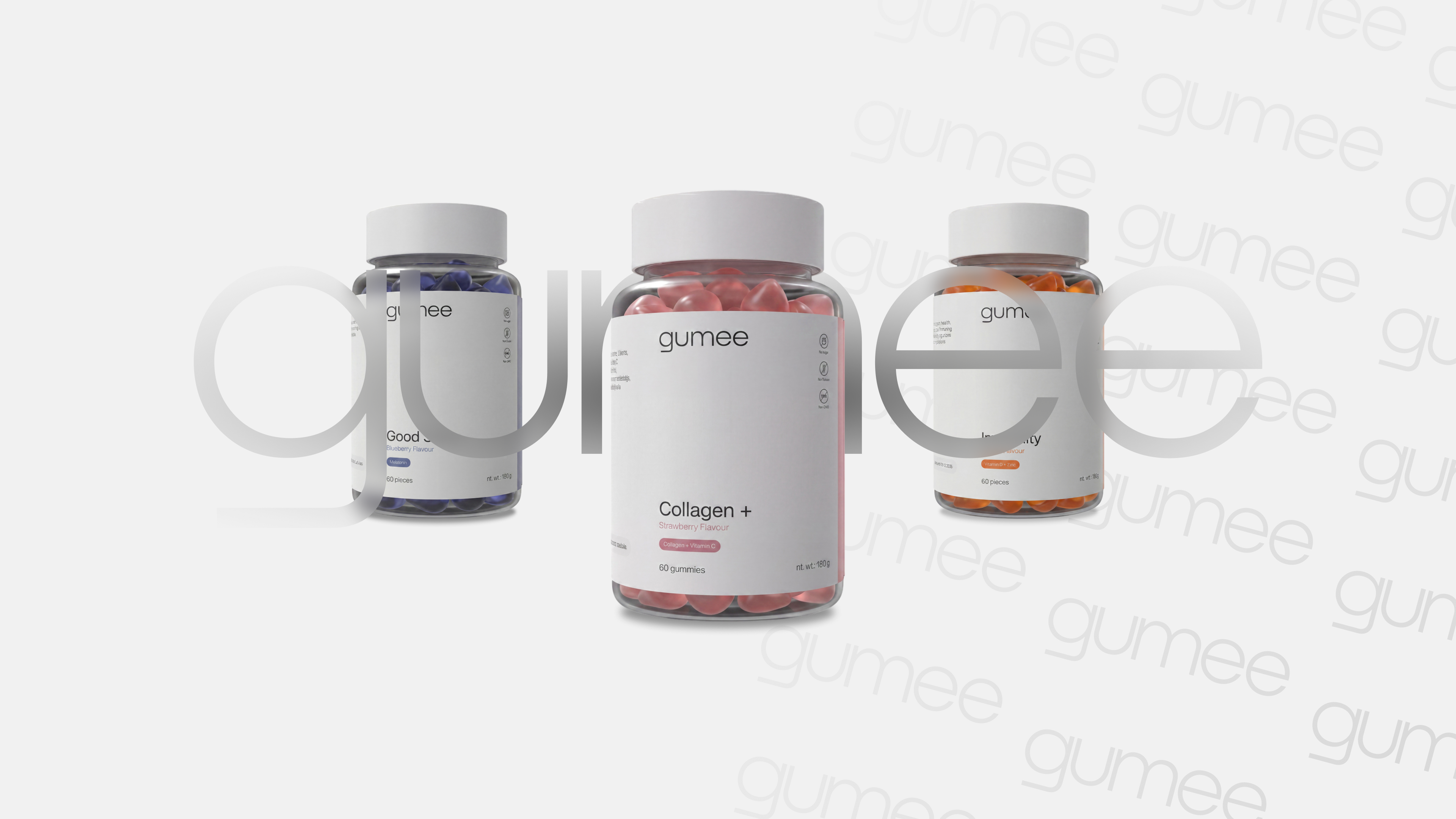
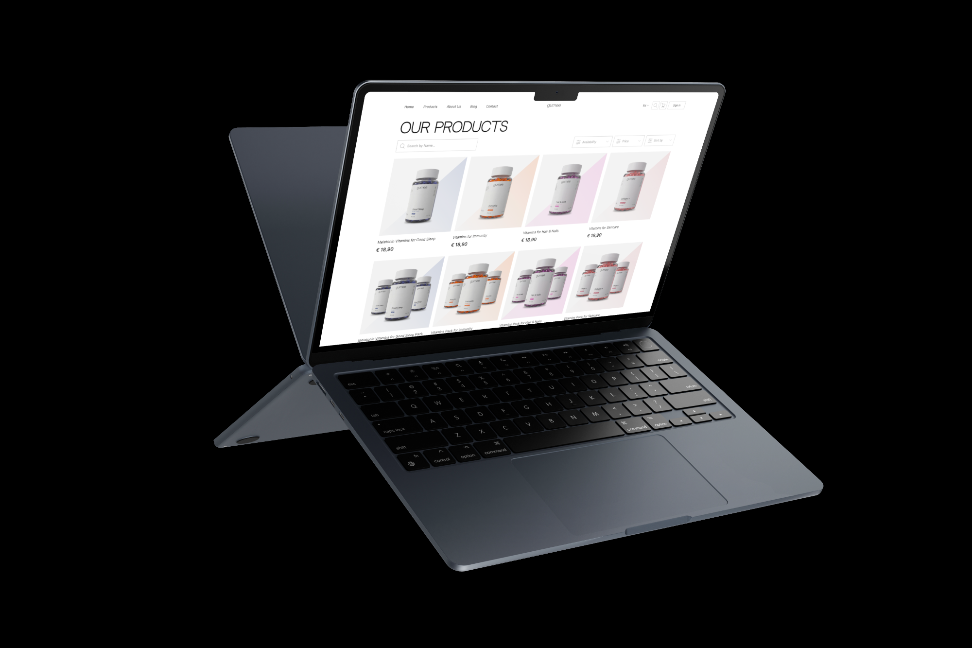
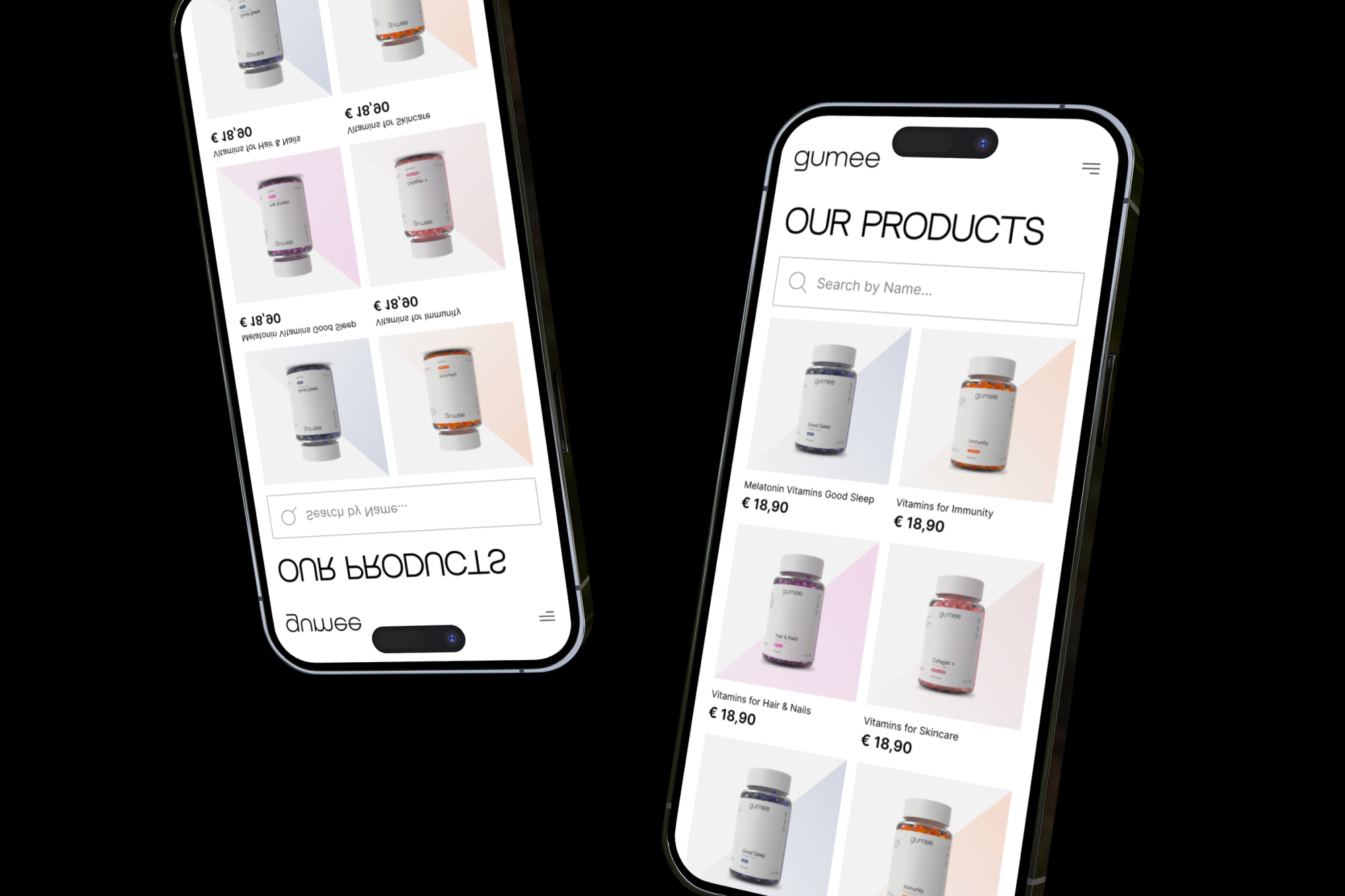
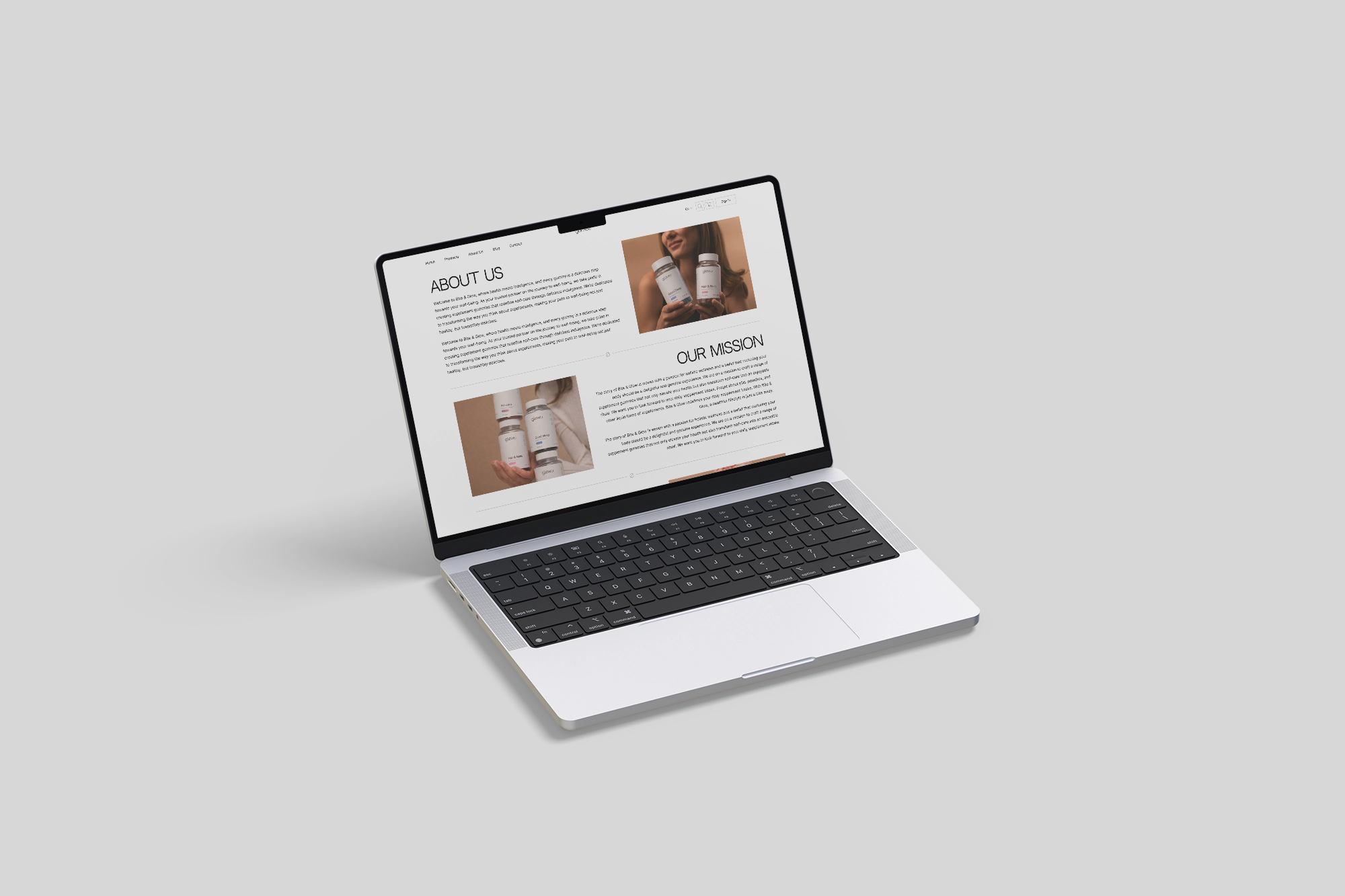
Gumee is a modern e-commerce concept for a premium gummy vitamin brand. The project focuses on creating a clean, minimalist shopping experience where the products become the main visual element. Soft typography, generous white space, and subtle 3D product renders communicate quality, trust, and a contemporary lifestyle.
The goal was to design a memorable online store that feels more like a premium cosmetics brand than a traditional supplement website, making health products look desirable, elegant, and easy to explore.
CONTEXT
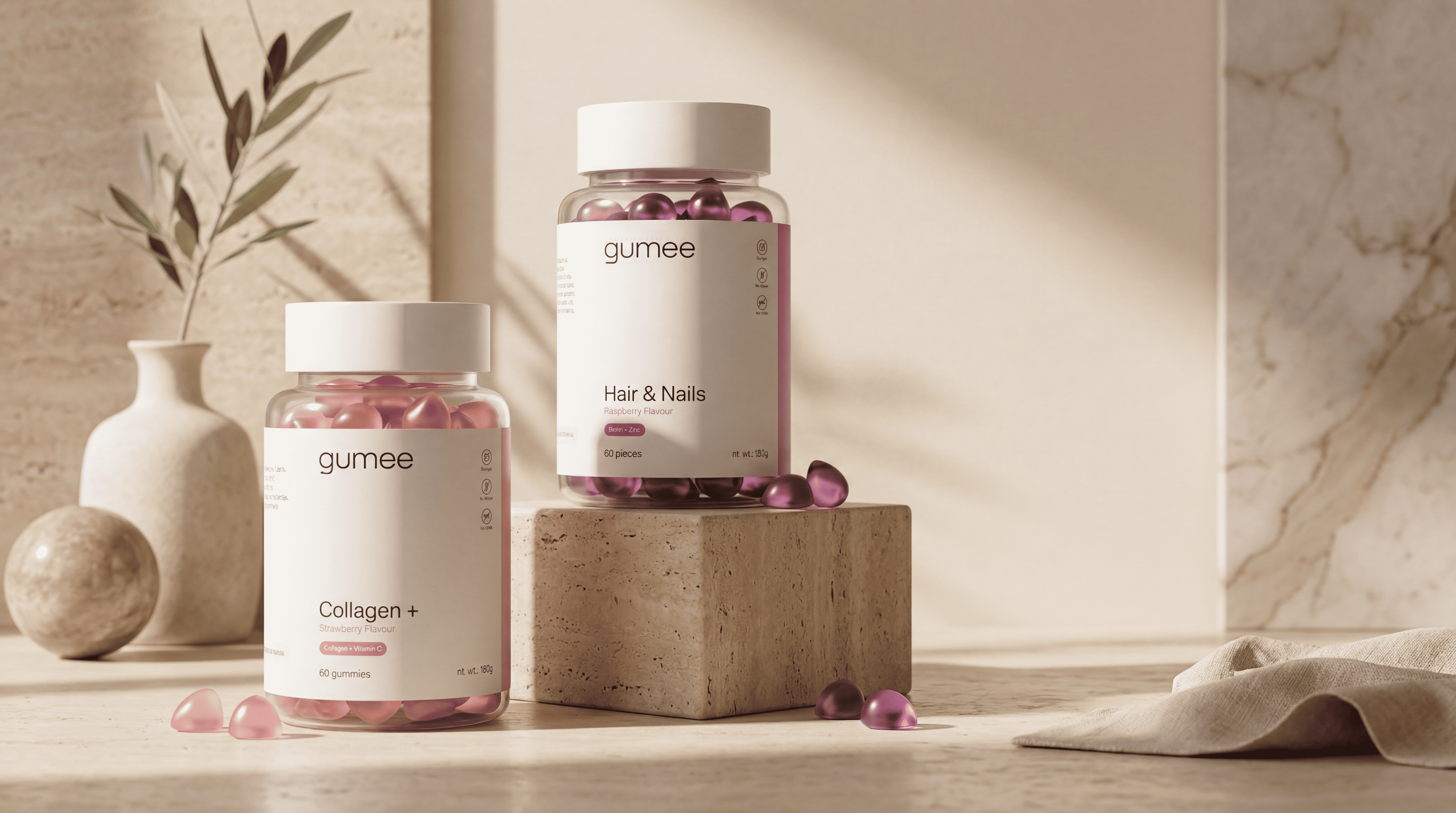
The dietary supplement market is often dominated by cluttered packaging, overwhelming product pages, and outdated visual language. While many brands focus on technical specifications, they fail to create an emotional connection with their audience.
The objective of this project was to rethink the online shopping experience for gummy vitamins by combining premium branding with a clean, minimal interface. The design emphasizes product quality through elegant typography, refined layouts, and realistic 3D visuals, transforming everyday supplements into a desirable lifestyle product.

LOGO DESCRIPTION
The Gumee logo is built around simplicity, balance, and approachability. Its geometric letterforms and rounded edges reflect the soft shape of gummy vitamins while communicating a modern, premium aesthetic.
The clean typography reinforces the brand's minimalist identity, allowing the products to remain the primary visual focus. With its timeless appearance and strong readability, the logo creates a recognizable identity that feels both friendly and sophisticated across digital and physical touchpoints.
TYPOGRAPHY & COLORS
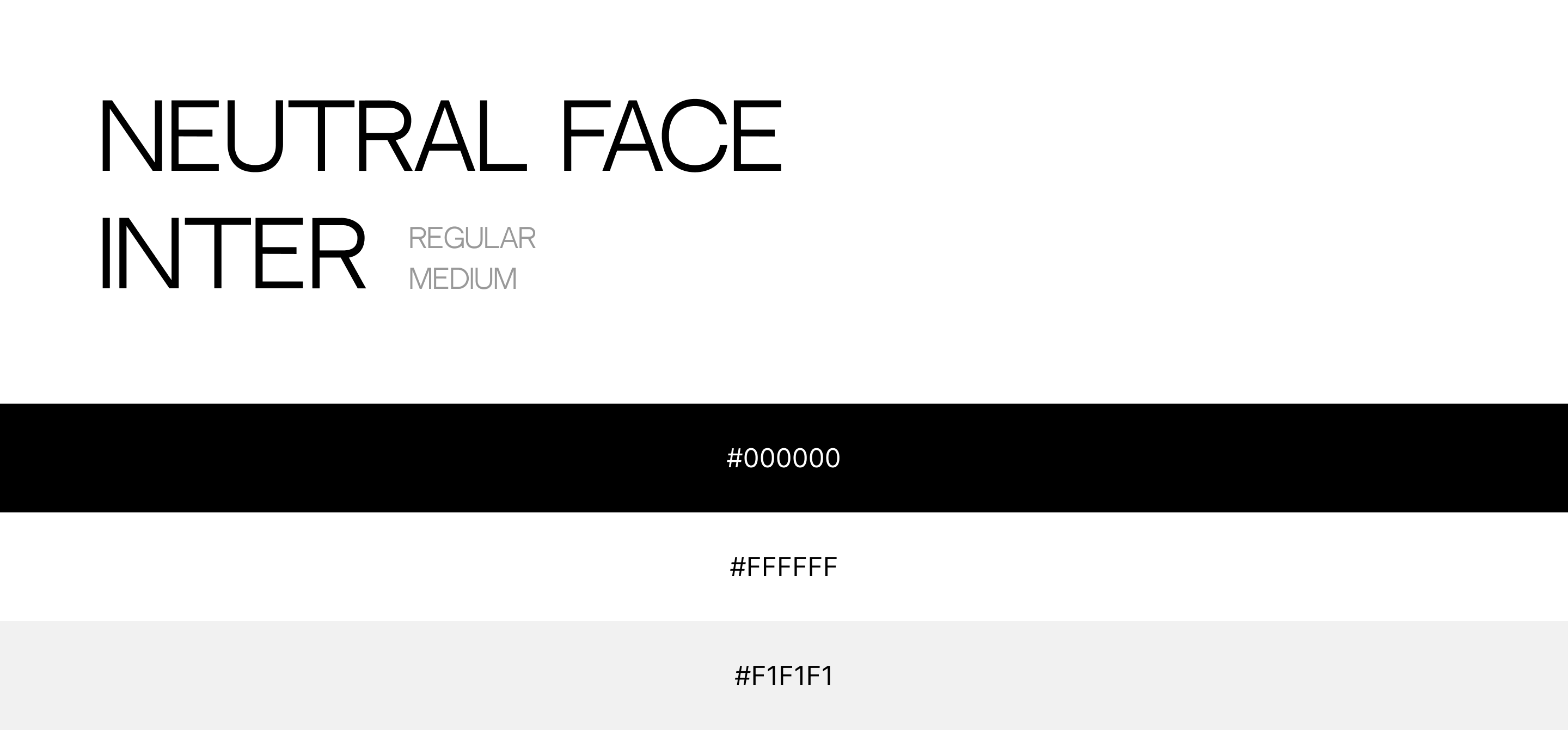
The visual system is built on a restrained palette and modern typography to reinforce the brand’s premium positioning. Neutral Face is used for bold headlines, giving the interface a distinctive and elegant character, while Inter ensures excellent readability across body text, navigation, and product information.
A monochrome color palette keeps the experience clean and distraction-free, allowing the products to become the primary visual focus. Black provides strong contrast and confidence, white creates openness and clarity, and a soft gray adds subtle depth while maintaining the minimalist aesthetic.
Final Summary
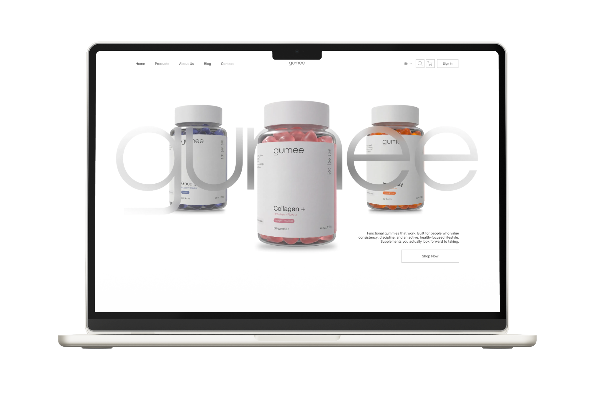
Gumee is a concept that explores how thoughtful design can transform an everyday product into a premium digital experience. By combining minimalist layouts, refined typography, and high-quality 3D product visuals, the project creates a clean and memorable identity that communicates trust, simplicity, and modern wellness.
Every design decision was guided by a single goal—to let the products speak for themselves while delivering a seamless shopping experience. The result is an elegant e-commerce concept that balances aesthetics with usability and presents gummy vitamins through a fresh, contemporary perspective.
