ChipInCafe
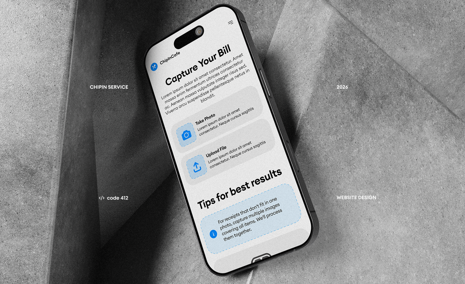
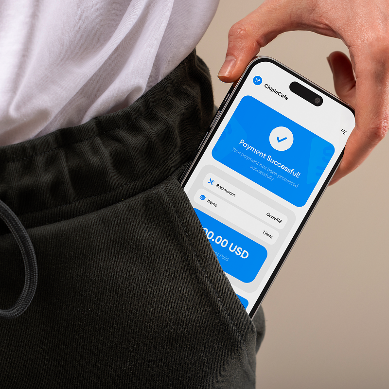
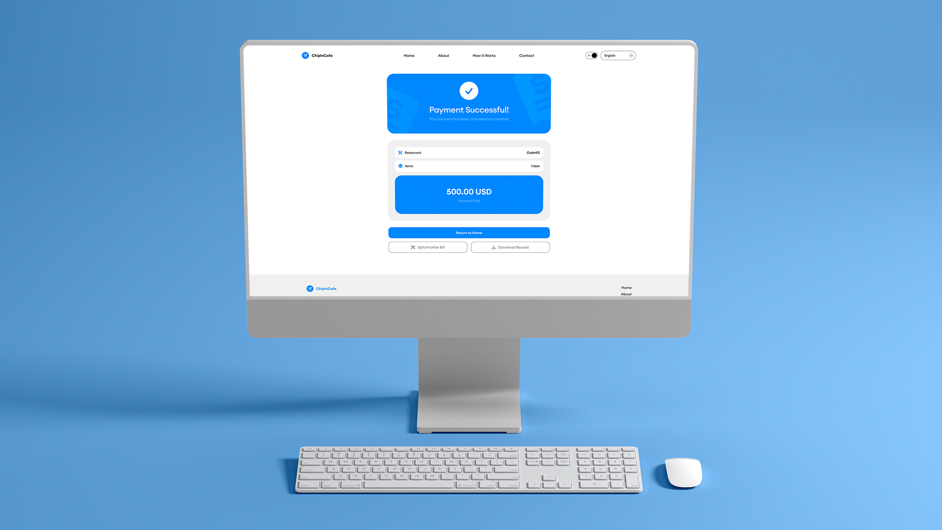
ChipInCafe is a service that simplifies bill splitting and payment confirmation in restaurants. It helps users review itemized orders, verify quantities and prices, choose the payment currency, and make quick edits before completing payment. The goal is to make group payments transparent, fast, and error-free.
CONTEXT
Splitting restaurant bills is still an inconvenient and frustrating experience. Usually, one person pays for the entire order while everyone else sends money manually afterward — often causing delays, confusion, incorrect amounts, and awkward conversations about tips.
This problem becomes even more noticeable in larger groups, where users need a fast and simple way to divide expenses without interrupting the social experience.
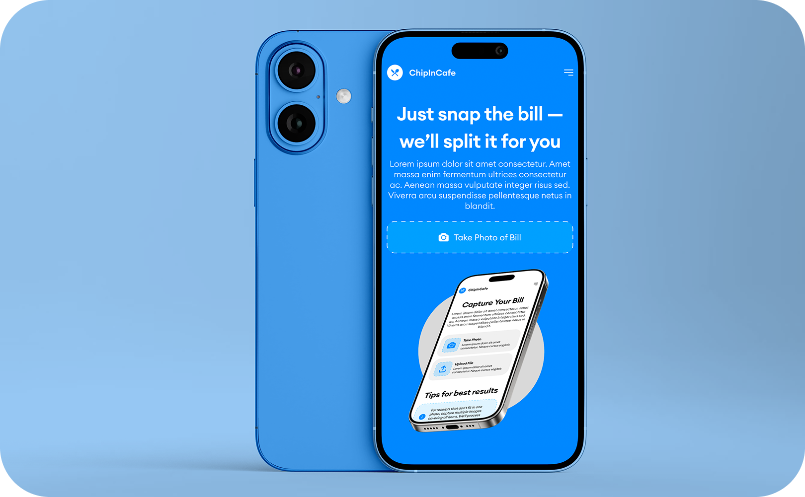
ChipInCafe was created to simplify this process and turn bill splitting into a smooth mobile-first experience. The core idea of the product is simple: users can scan a receipt, automatically recognize bill items, split the payment between friends, and share the result instantly through a QR code or link.
The main goal of the project was to design a clean and intuitive interface that reduces friction and minimizes the number of actions required to complete the flow.
Special attention was given to mobile usability, visual hierarchy, and creating an interface that feels lightweight and approachable for users of different age groups and digital experience levels.

LOGO DESCRIPTION
The ChipInCafe logo combines a minimal symbol with a bold geometric wordmark to create a modern and approachable brand identity.
The icon is built around crossed dining utensils inside a blue circular shape, directly referencing cafés, restaurants, and shared dining experiences. The simplified form keeps the mark recognizable even at small sizes while reinforcing the product’s connection to food and bill splitting.
The bright blue color was chosen to communicate trust, speed, and digital simplicity, helping the product feel lightweight and user-friendly.
The typography uses a clean rounded sans-serif style that balances friendliness with clarity. Its bold appearance improves readability across both mobile and web interfaces while supporting the product’s modern fintech-oriented positioning.
Together, the symbol and typography create a visual identity that feels simple, social, and instantly connected to the idea of sharing expenses in cafés and restaurants.
TYPOGRAPHY & COLORS
The visual language of ChipInCafe is built around clarity, accessibility, and digital simplicity. Euclid Circular A serves as the foundation of the typographic system, introducing a modern geometric character with soft rounded forms that feel approachable and easy to interact with. Its clean construction reinforces the product’s mobile-first experience while maintaining strong readability across interfaces.
Euclid Circular A Semibold is used as the primary display weight, creating emphasis and visual confidence within headlines, key actions, and important interface elements. Euclid Circular A Regular complements the system as a secondary weight, supporting balance, readability, and a smooth content flow throughout the product experience. Together, the two weights establish a refined visual rhythm that feels both contemporary and lightweight.
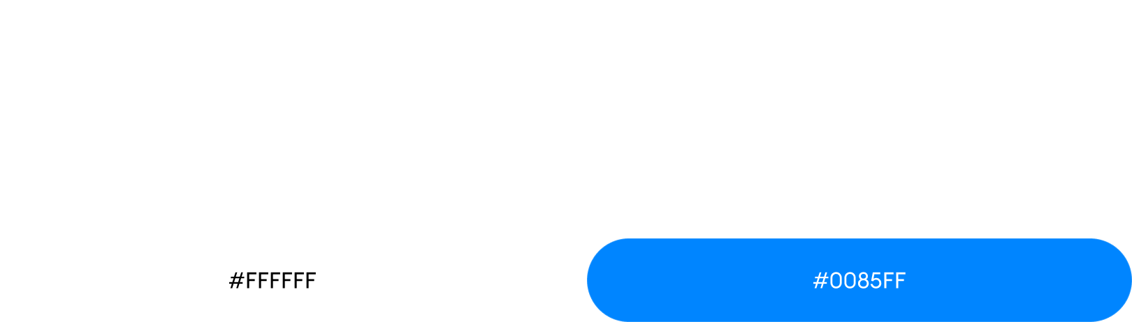
The color palette is intentionally minimal to support a distraction-free user experience. Bright blue (#0085FF) acts as the primary brand color, symbolizing trust, speed, and seamless digital interaction, while pure white (#FFFFFF) introduces openness, clarity, and spaciousness across the interface. This restrained contrast enhances usability and helps the product maintain a clean and intuitive visual identity across both mobile and web platforms.
Final Summary
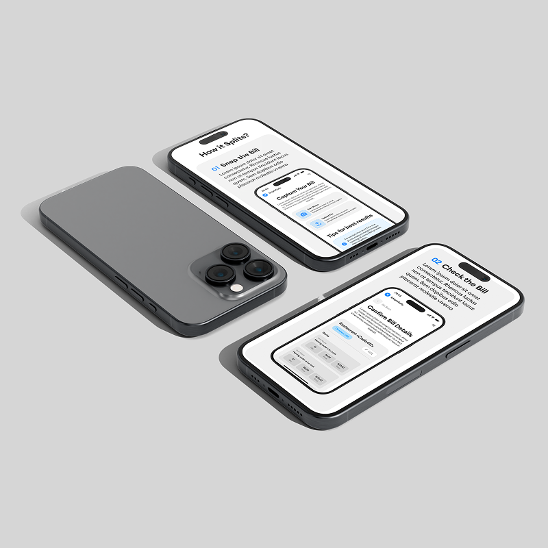
ChipInCafe was designed as a simple and intuitive solution for one of the most common social payment frustrations — splitting restaurant bills. The project focused on transforming a traditionally inconvenient process into a seamless digital experience centered around speed, clarity, and accessibility.
Through a clean visual system, minimal interface approach, and mobile-first UX strategy, the product reduces friction and allows users to move through the entire flow effortlessly — from scanning a receipt to sharing and completing payments.
The identity combines modern geometric typography, a restrained color palette, and lightweight interface patterns to create a product that feels approachable, trustworthy, and easy to use. Every design decision was made to support usability while maintaining a strong and recognizable visual presence.
The final result is a cohesive digital experience that simplifies group payments and reflects the fast, social, and convenient nature of modern mobile interactions.