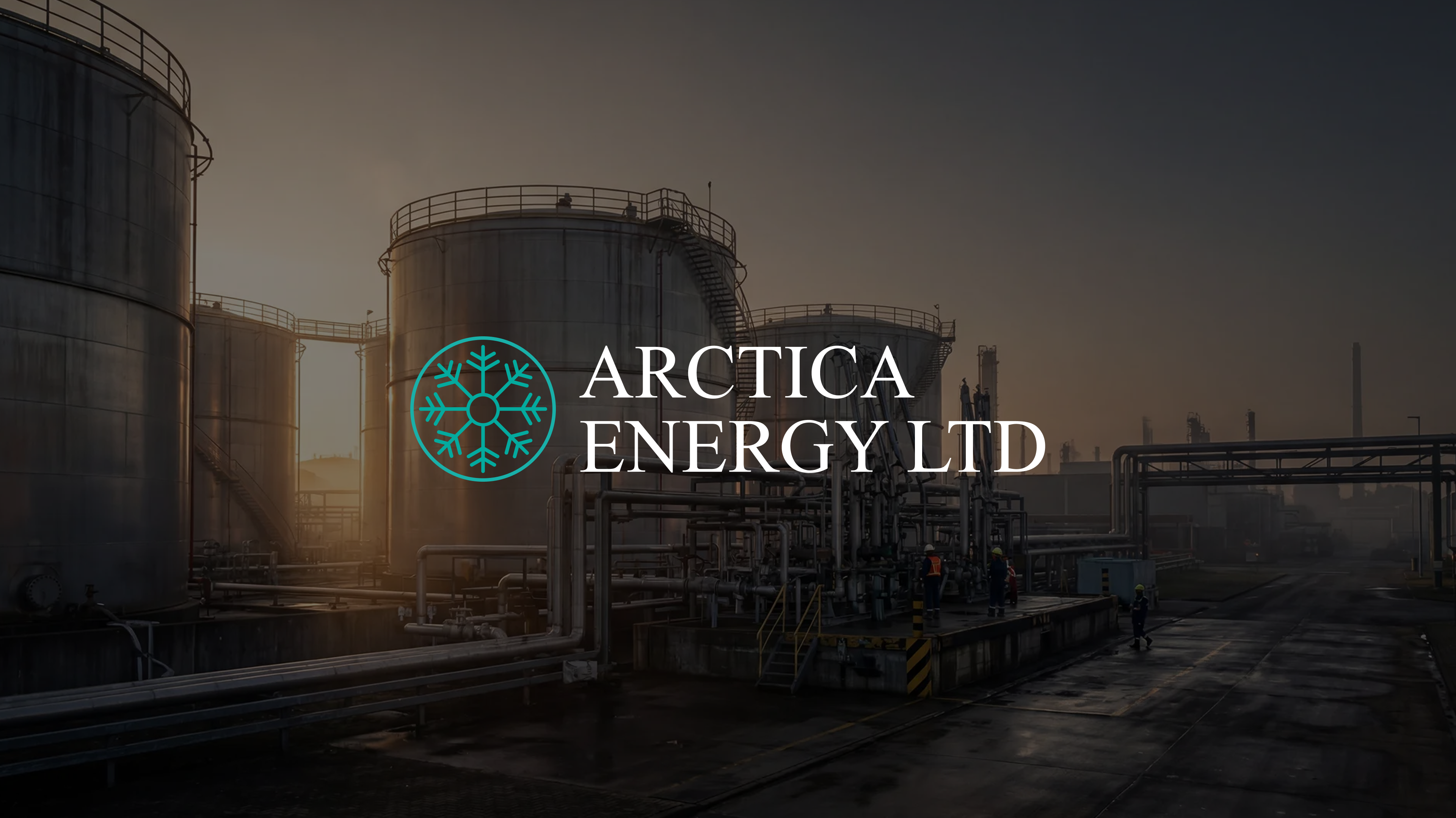
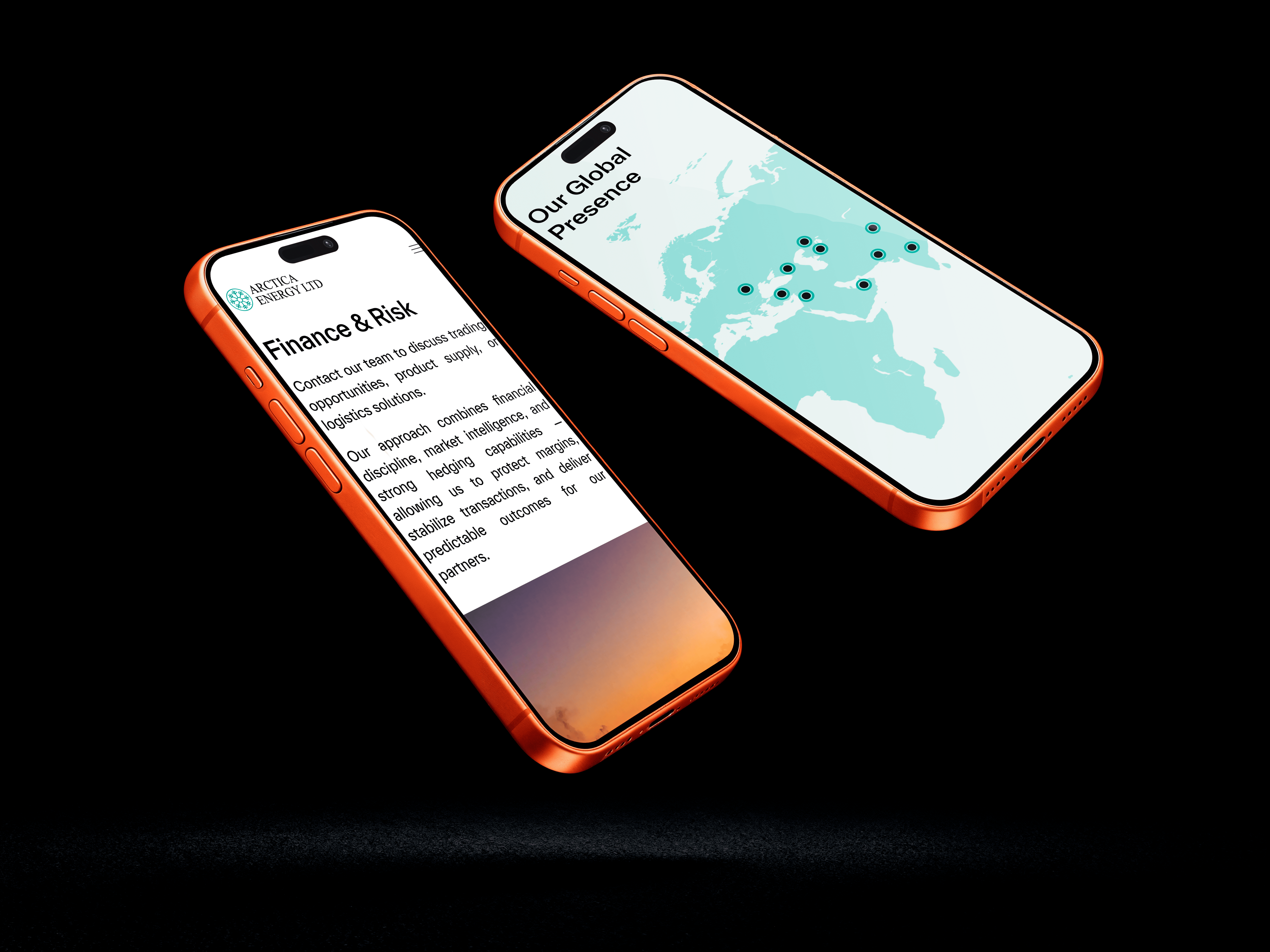
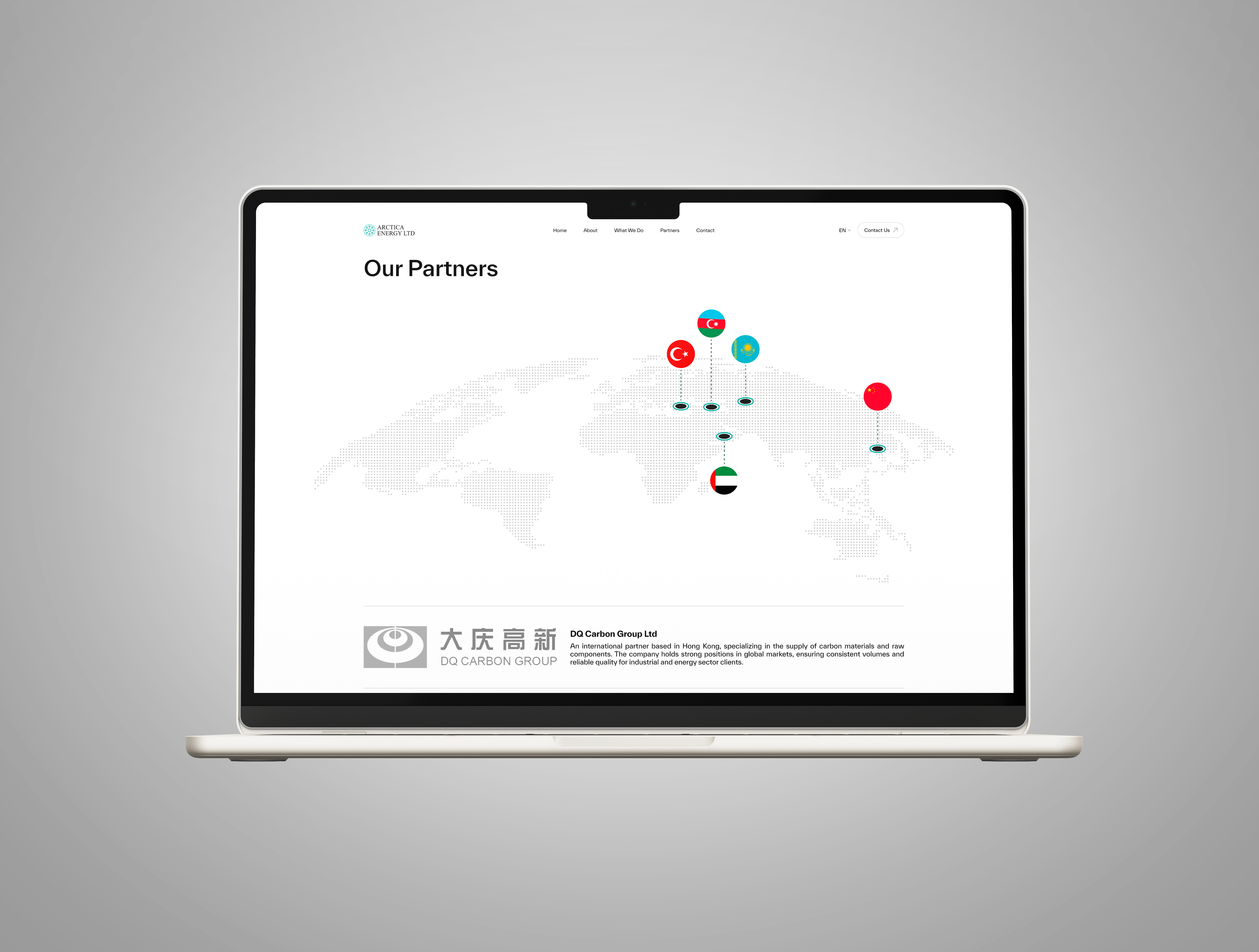
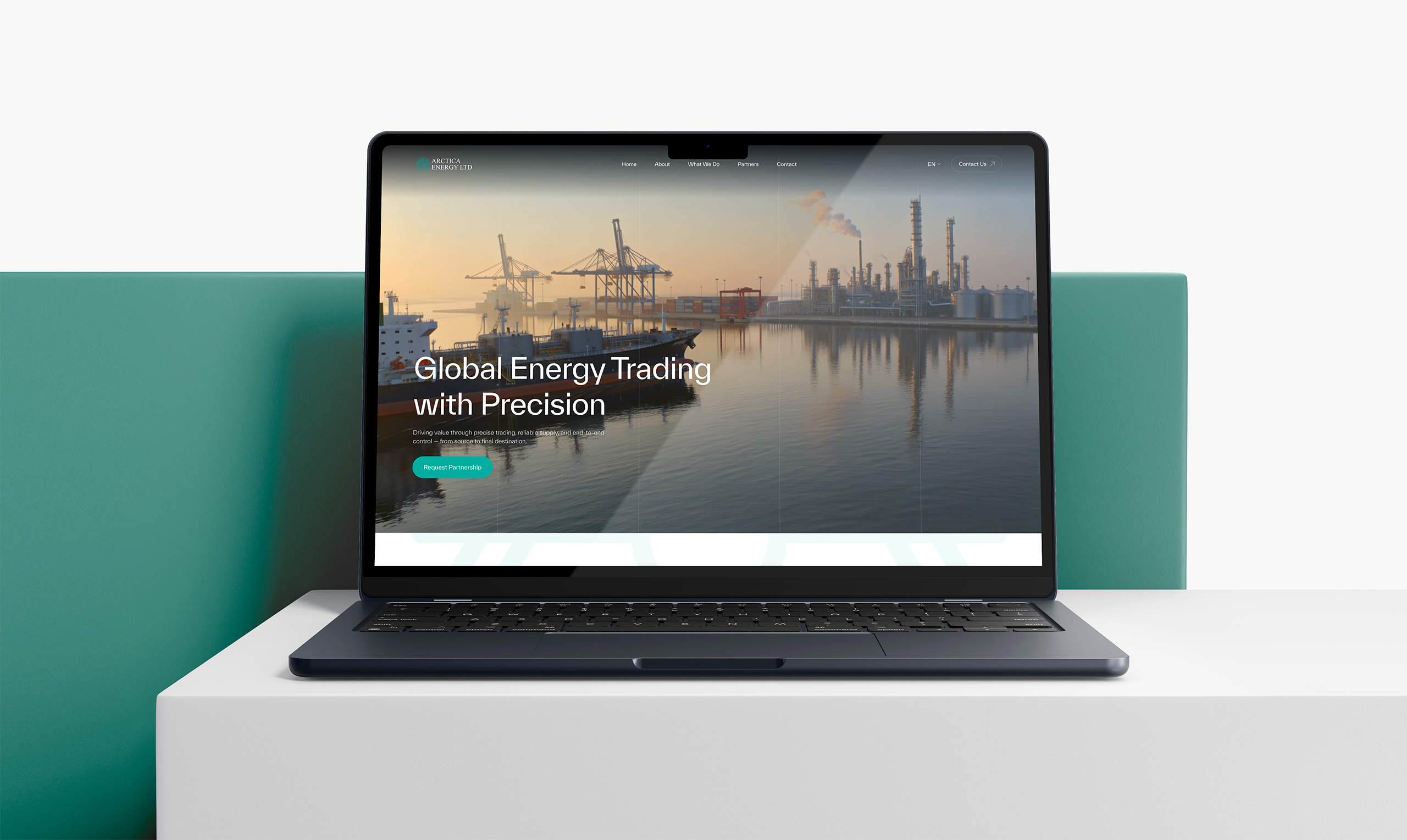
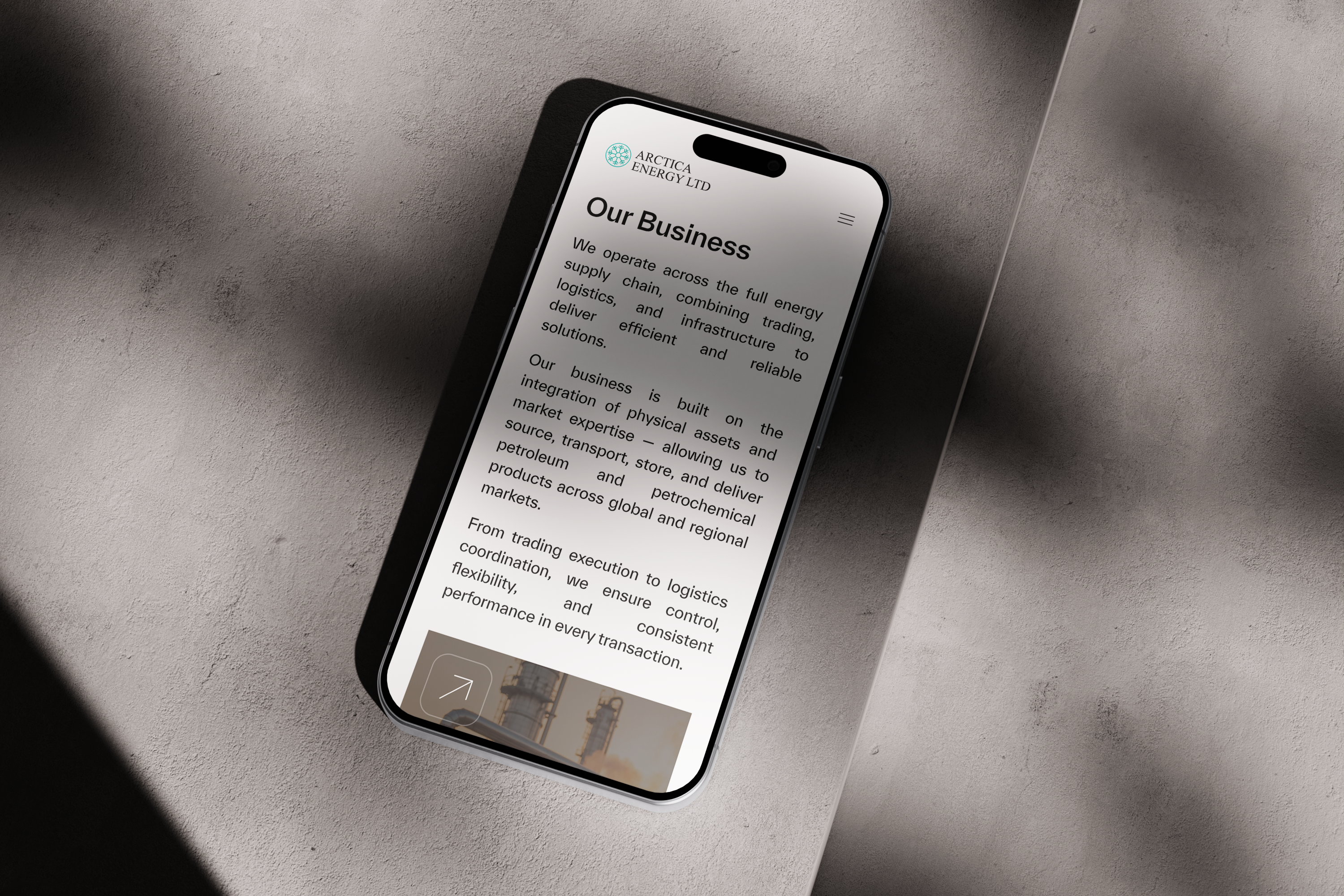
Arctica Energy is a global commodity trading company specializing in petroleum products, petrochemicals, and industrial energy solutions across Asian and European markets. The website presents the company as a reliable and experienced energy partner, highlighting its international operations, storage infrastructure, and expertise in fuel additives, oil treatment, and logistics. Its visual identity combines industrial aesthetics with a modern corporate approach, emphasizing scale, efficiency, and global connectivity.
CONTEXT
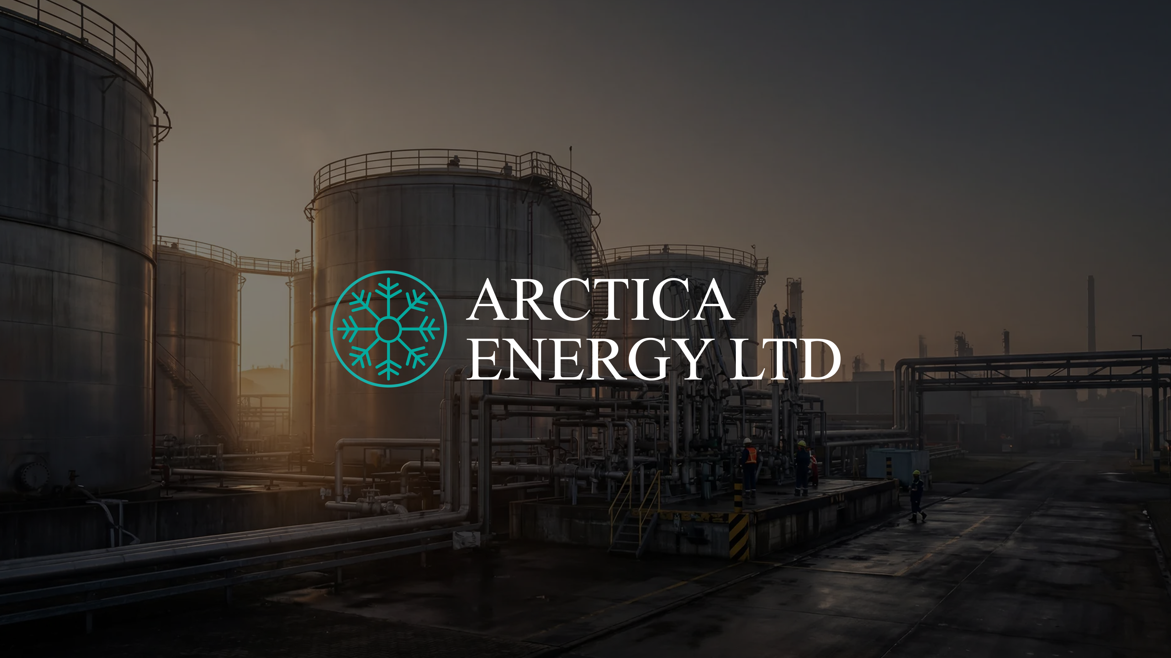
The goal of the project was to create a modern corporate website that reflects Arctica Energy’s position as an international energy trading company operating across multiple markets. The challenge was to present a highly technical and industrial business in a clear, trustworthy, and visually engaging way while maintaining a premium corporate feel. The website needed to communicate the company’s scale, expertise, and global logistics capabilities through a clean structure, strong typography, and a confident visual language.


LOGO DESCRIPTION
The Arctica Energy logo combines a minimal snowflake symbol with elegant serif typography to create a balance between industrial reliability and premium corporate identity. The snowflake icon reflects the brand’s connection to energy, precision, and northern-origin symbolism, while the turquoise accent adds a modern technological feel against the dark background. The refined typography reinforces trust, stability, and an international business presence.
TYPOGRAPHY & COLORS
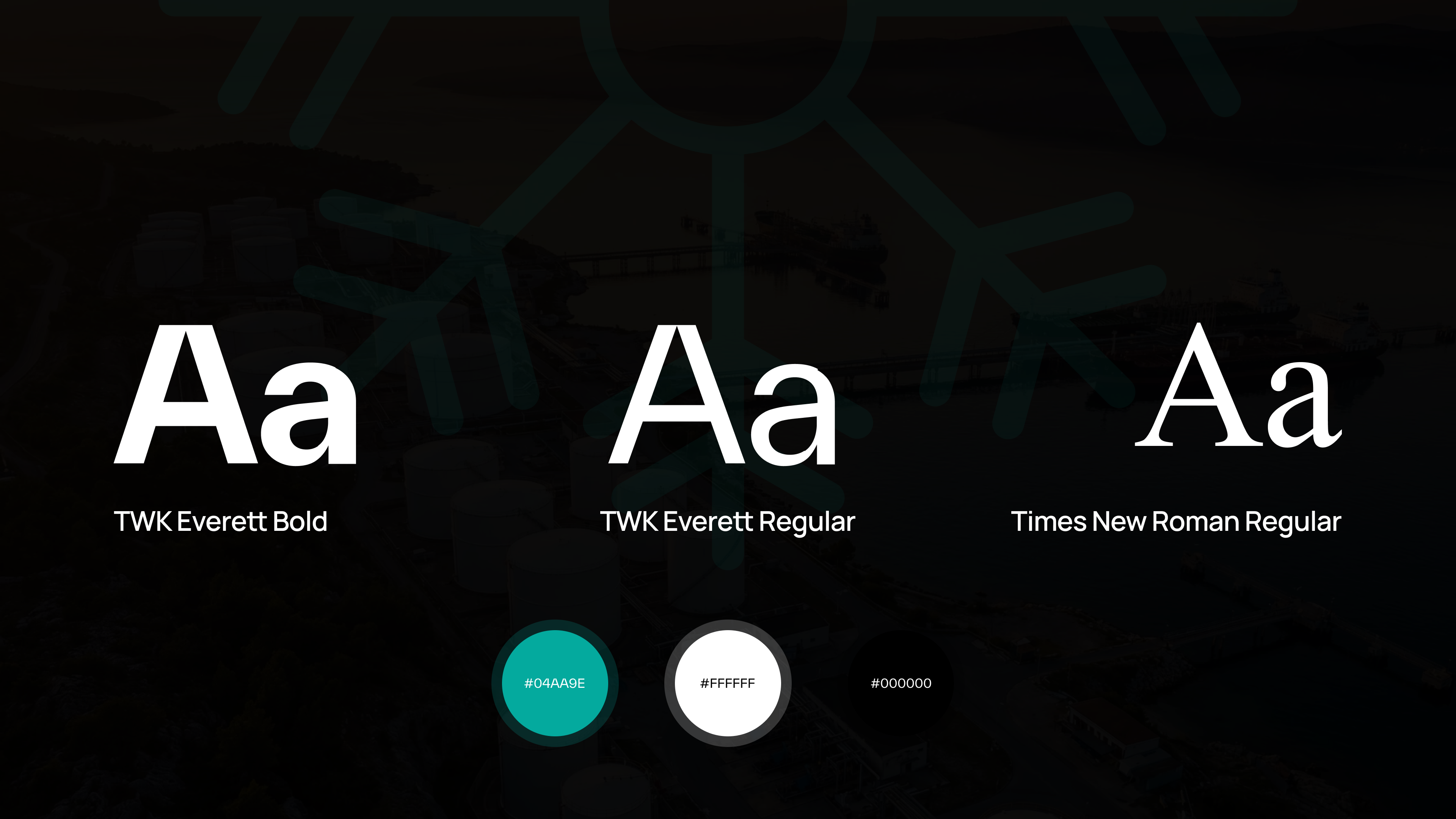
The visual system is built around a combination of modern sans-serif typography and classic serif accents to create a balance between clarity and corporate sophistication. TWK Everett is used as the primary typeface for headings and interface elements, providing strong readability and a clean contemporary appearance, while Times New Roman adds a more formal and established character to selected branding elements.
The color palette is intentionally minimal and high-contrast, centered around deep black, pure white, and a vibrant turquoise accent (#04AA9E). The turquoise tone reinforces the brand’s technological and energy-focused identity, while the monochrome foundation helps maintain a premium, confident, and industrial aesthetic across the entire website.
Final Summary
The final result is a modern corporate website that transforms a complex industrial business into a clear and visually engaging digital experience. Through a combination of refined typography, a restrained color palette, strong visual hierarchy, and atmospheric imagery, the design communicates Arctica Energy’s reliability, international scale, and technological expertise. The project successfully balances corporate professionalism with a contemporary aesthetic, creating a distinctive online presence that strengthens the brand’s credibility and positioning within the global energy sector.